Websites for Clients
2018
UC Berkeley Sustainability
https://sustainability.berkeley.edu/
This summer project was an update to a redesign that I did in 2014.
2016
For Bancroft Library,
The Japanese American Relocation ad Settlement Digitial Archive
https://bancroft.berkeley.edu/collections/jacs/index.html
(From "About" page"...) In 2011, the Bancroft Library was awarded its first grant by the National Park Service's Japanese American Confinement Sites Grant Program. What started as a two-year digitization project flourished into a now multi-grant digitization project digitizing nearly 250,000 primary source materials that focuses on Japanese-American experience during WWII. The selections consist of institutional records, personal documents, and formats like moving-image film, audio, maps, and artworks. Access to the digitized content is provided by the Online Archive of California, and Calisphere.
I was the User Experience Designer for this site, responsible for front end design (the "look and feel" of the site), image procurement and adjustment, and the information architecture. I worked for archivists at Bancroft to ensure content accuracy.
2015
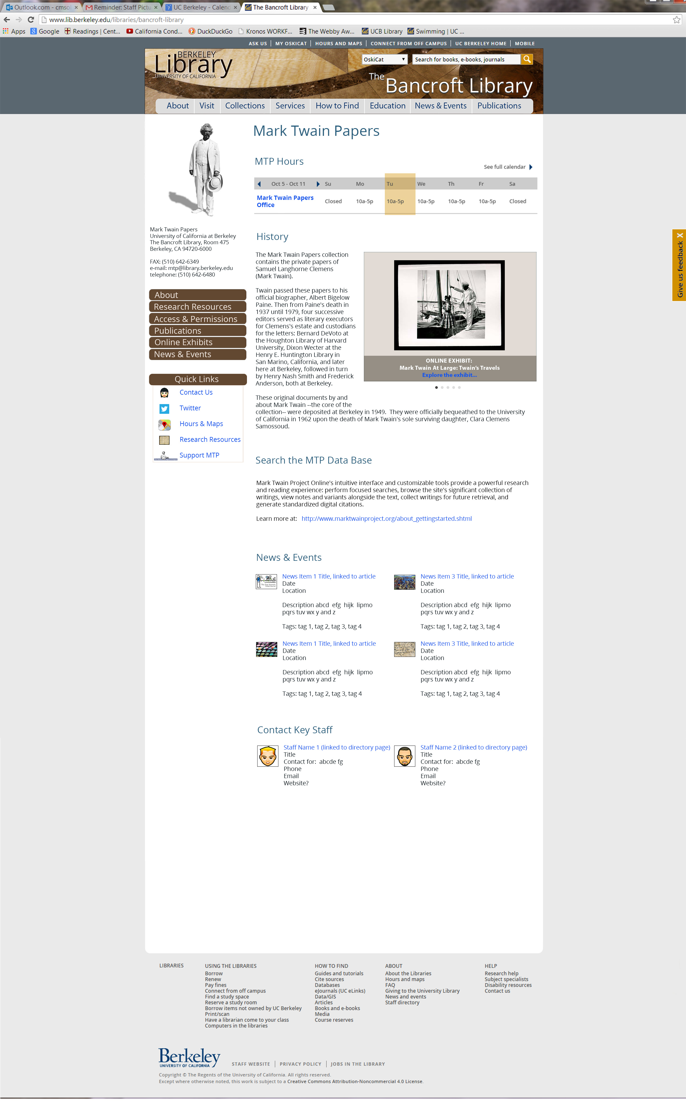
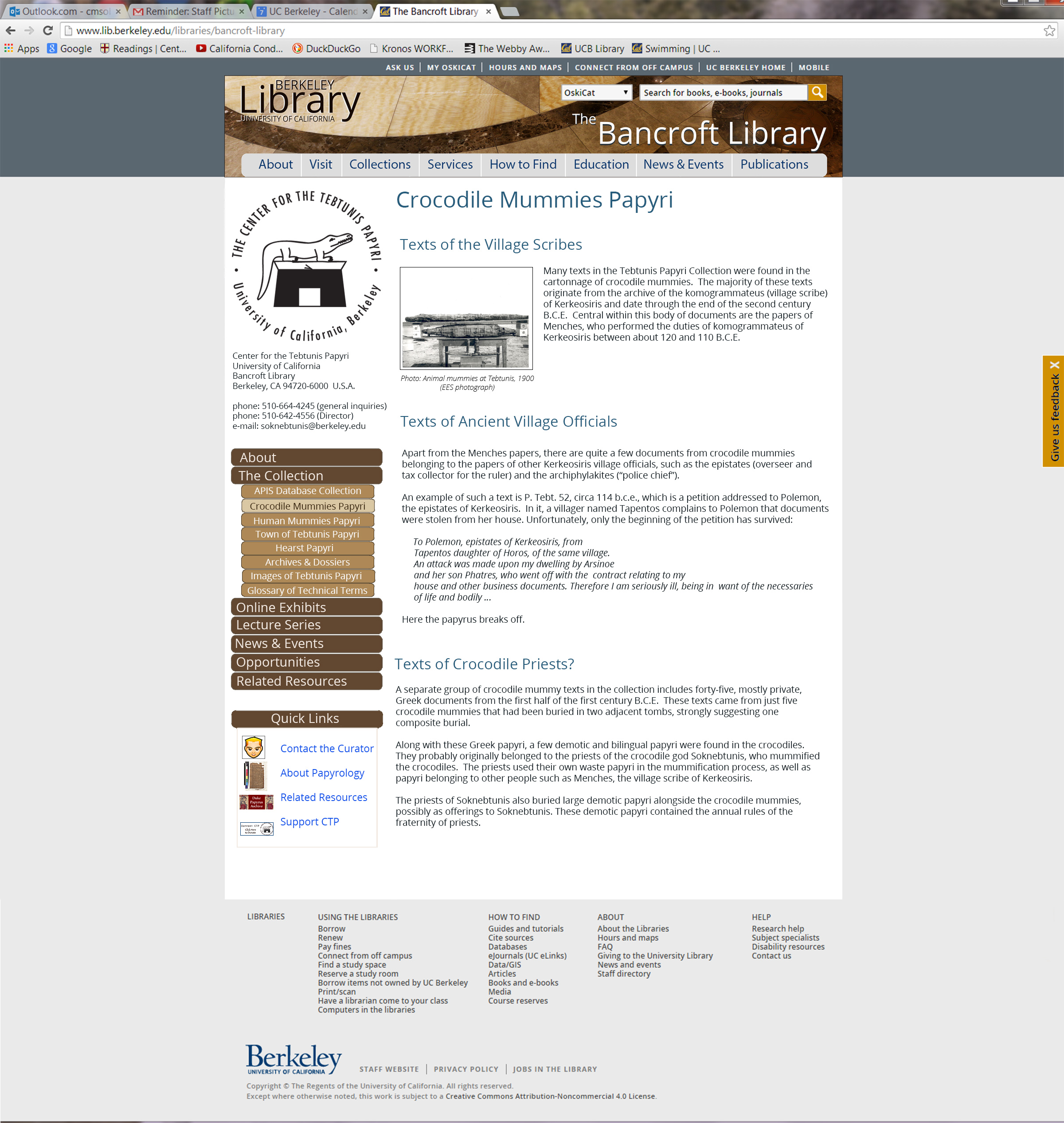
Bancroft Library Redesign Mockups, UC Berkeley (in Drupal)
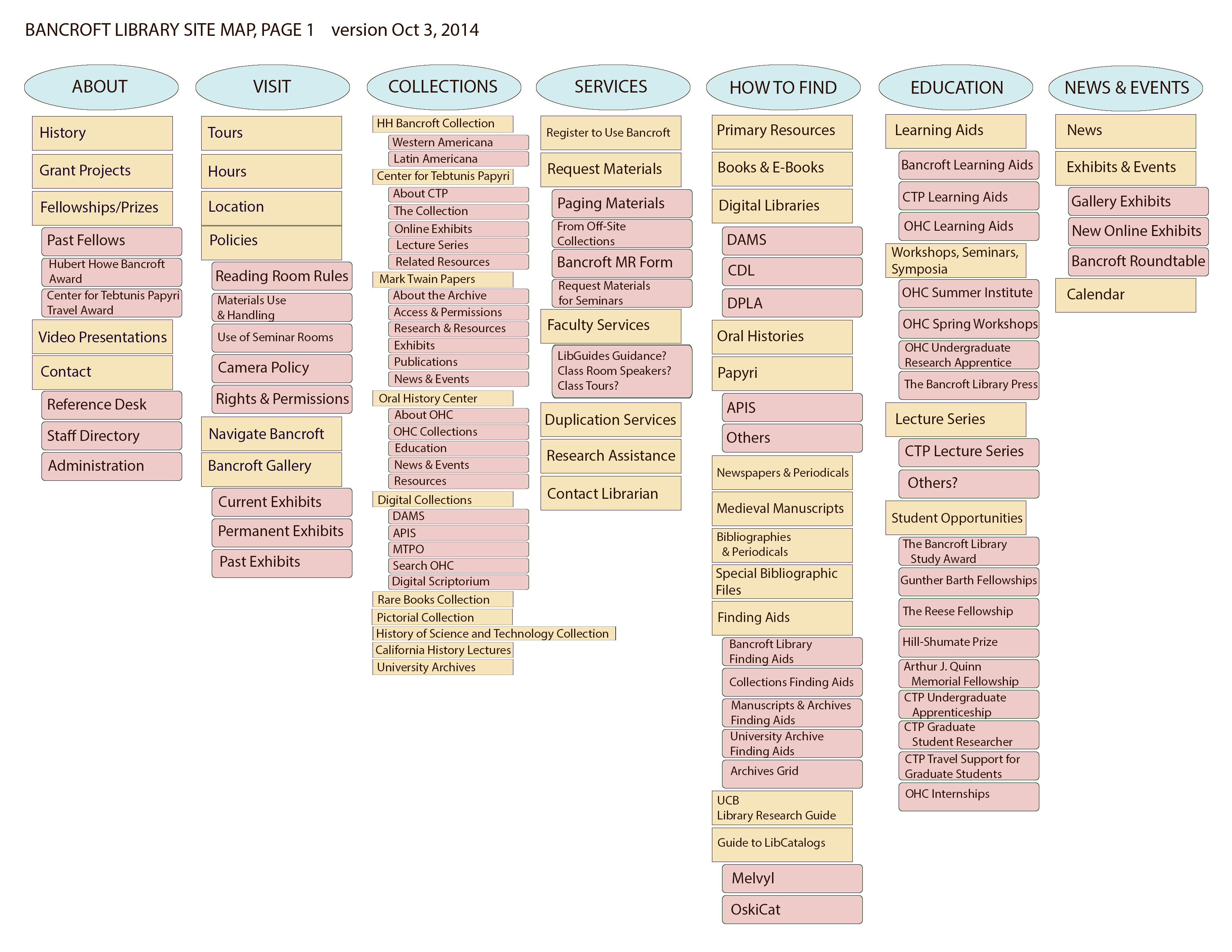
I was the User Experience Designer for this site, responsible for front end design (the "look and feel" of the site) and the information architecture. Redesigning the information architecture for this site was no small feat. My map of the original site was 53 pages long, and the site was so old and had been maintained by so many hands that it was like the Winchester Mystery House, with hallways to dead ends and doors that opened to two-story drops.
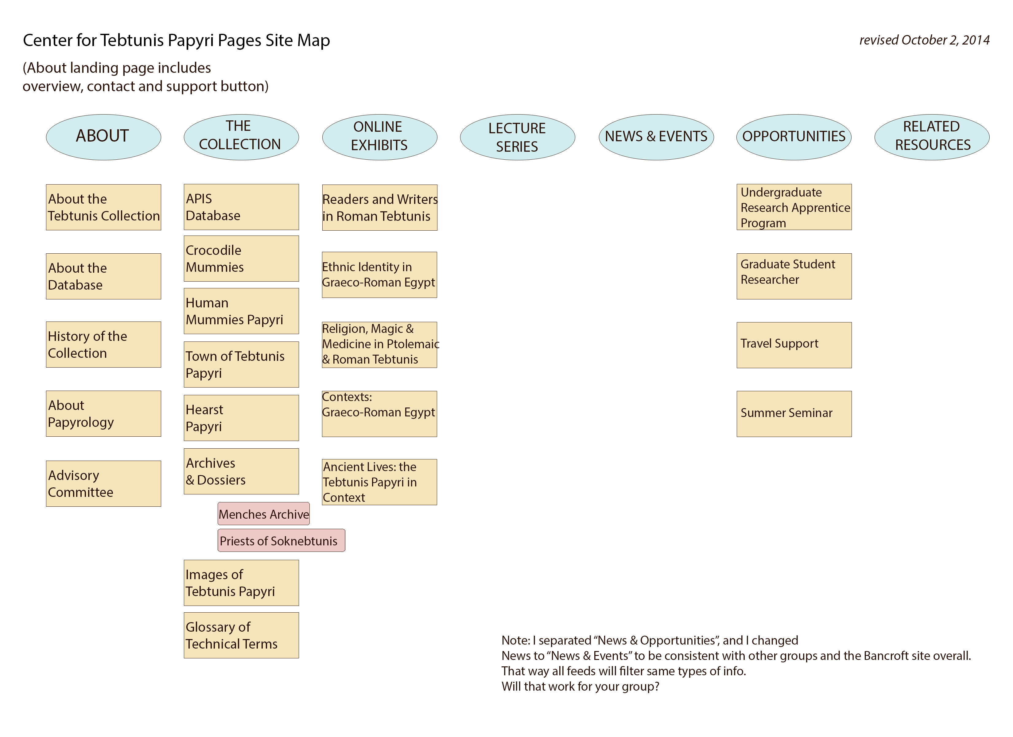
Besides massive reorganizing and updating from a static site to a Drupal site, the goal of this redesign is to integrate the Bancroft Library site, like other speciality library sites, into the template for the overarching UC Berkeley library site. Additionally, the Bancroft has three special research centers--The Center for Tebtunis Papyri, the Mark Twain Papers, and the Oral Histroy Center--that each had their own freestanding sites, and those all had to be integrated into the Bancroft site, which was integrated into the UC Berkeley Library site. Think of nesting dolls.
How does one make a university template look as expressive and individualized as possible? This is a challenge I often face, such as with another large 2014 information architecture overhaul I did for the Office of Sustainability, combining 5 old static sites into 1 Drupal site. Here, for the Bancroft, foremost I designed a new header using an abstracted section of a photograph I took in the marble lobby of the Bancroft. I added a left nav menu that allowed for personalized colors, and I tweaked some placements.
PLEASE CLICK IMAGES FOR LARGER VERSIONS.
Sample of landing page for the Mark Twain Papers and interior page for the Center for Tebtuins Papyri (showing menu cascade):
Also see:
- a sample page from the UC Berkeley Library template I had to work within
- Bancroft Library NEW overview site map, page 1
- Bancroft Library NEW overview site map, page 2
- Drilling deeper, a sample of a research center site map for the Center for Tebtunis Papyri
2014
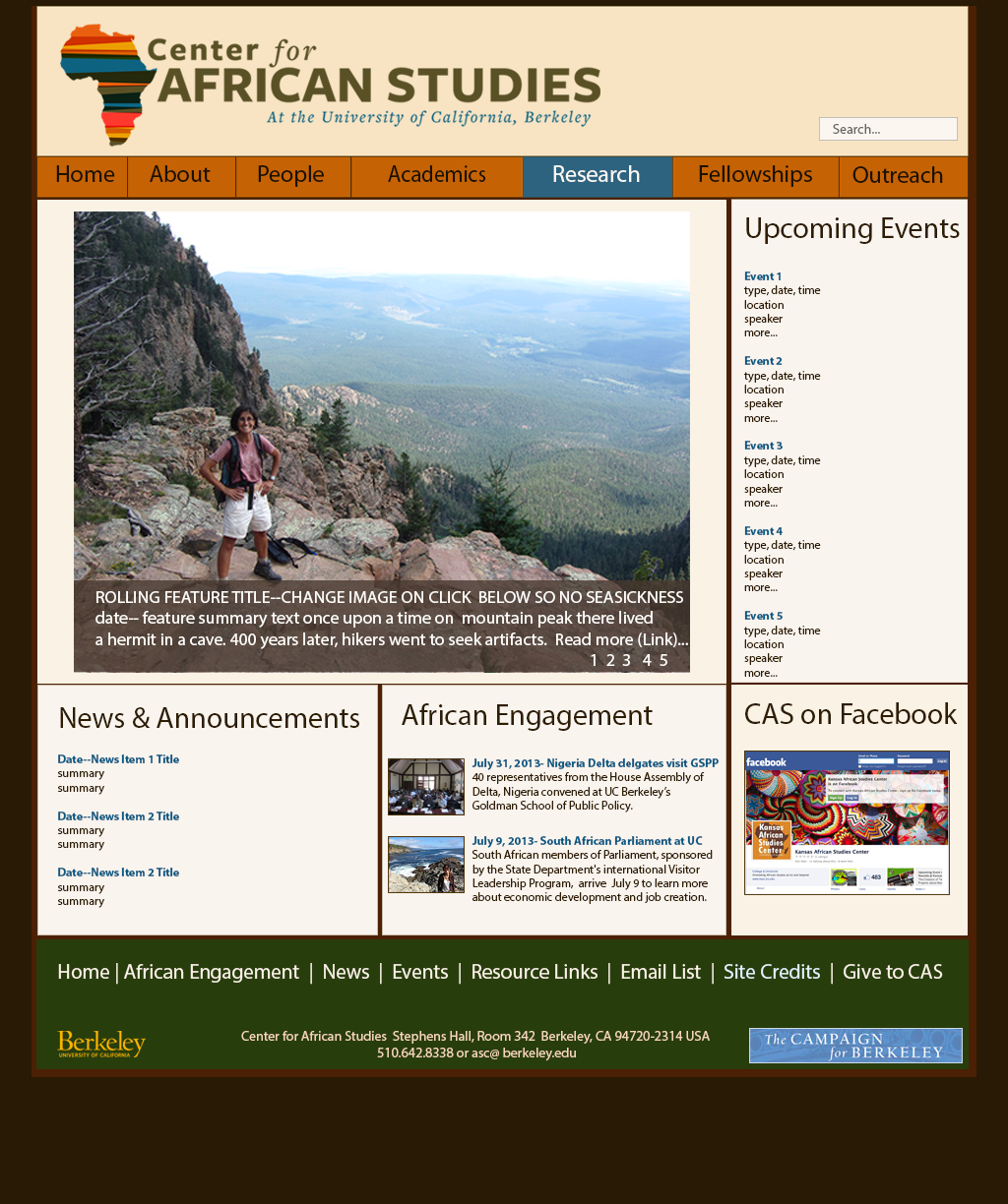
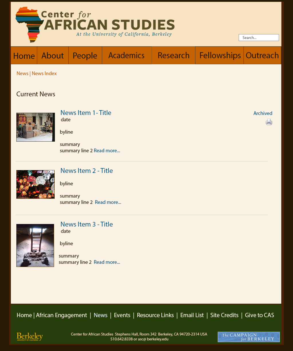
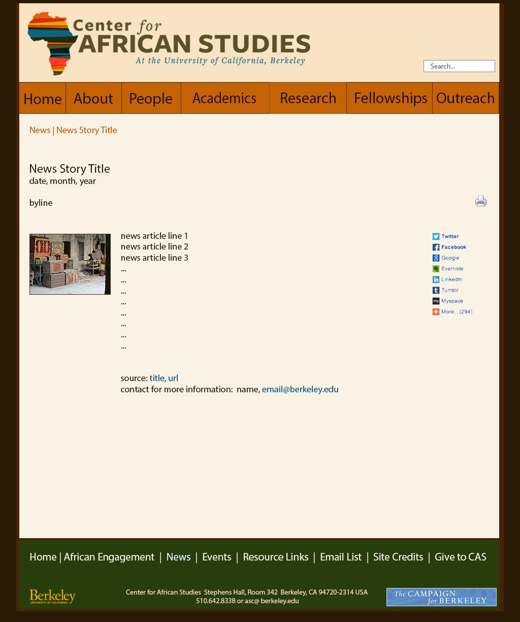
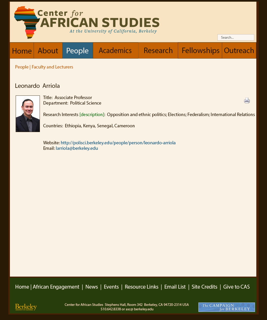
Center for Africa Studies redesign: https://africa.berkeley.edu/
Center for African Studies Redesign Mockups, UC Berkeley (for Drupal)
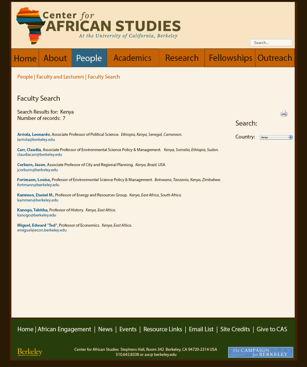
I was the User Experience Designer for this site, responsible for front end design (the "look and feel" of the site) and the information architecture. Howie Lan and Kim Carl programmed. I needed to design list pages and leaf pages for many different database-driven content types, including courses, faculty and language specialist searches, news, and events that linked to a university feed. As of January 2015, this site is still being built. Mockups are below.
PLEASE CLICK IMAGES FOR LARGER VERSIONS.
Additional samples: CAS Faculty Seach Page and CAS Faculty Leaf Page.
Office of Sustainability, UC Berkeley (in Drupal)
How does one make a university template look as expressive and individualized as possible? This is a challenge I often face because of budget contraints. In thisinformation architecture overhaul project for the Office of Sustainability, I combined 5 old static sites into 1 new UCB Drupal template site. To individualize the site, I created more communitarian, story-like page names that expressed the values of the center, rather than using academic standards; and I worked with their graphic designer, Erin Finley, to create an additional right nav menu out of graphics from the center's annual sustainability report.
2011
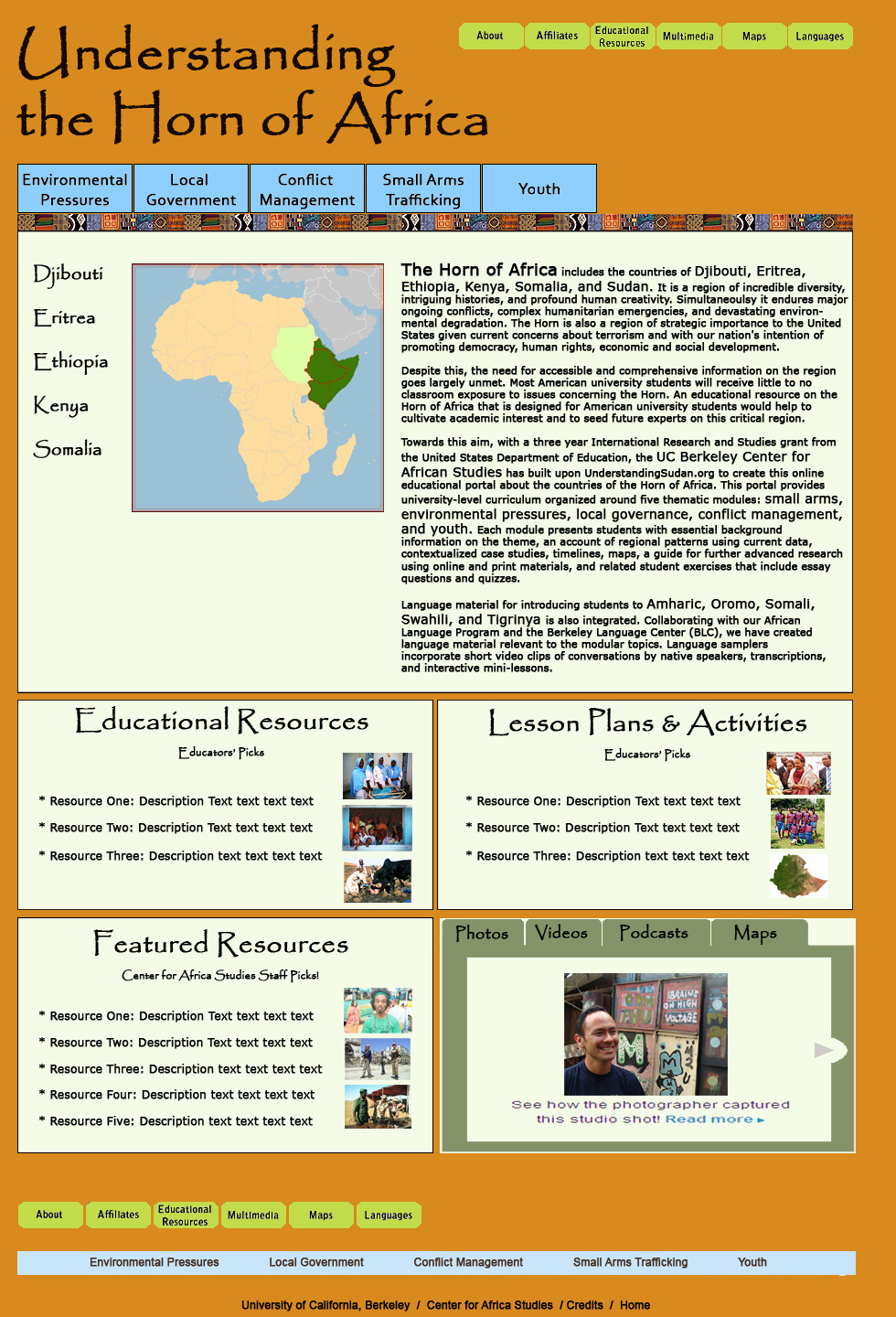
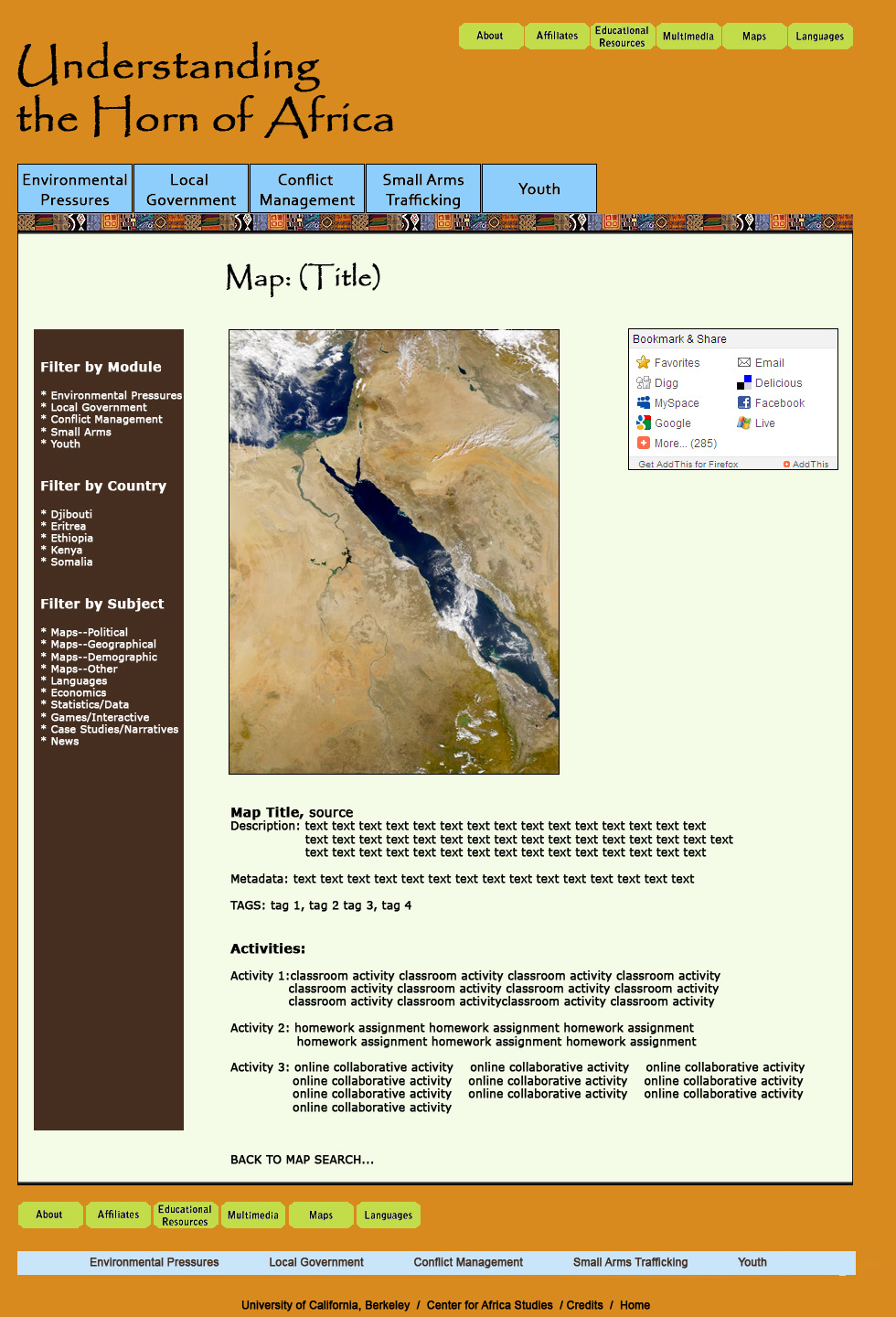
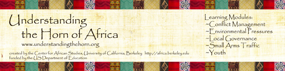
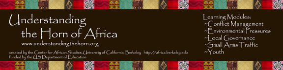
Understanding the Horn of Africa Mockups, UC Berkeley Center for African Studies (in Drupal)
This web portal project was funded by the US Department of Education. Unfortunately, Congress cut the US DoEd budget in half in the middle of our project, so half our grant was revoked. consequently, content was scaled back and my designs below were altered accordingly during the build process. Here, too, I was the User Experience Designer, responsible for front end design (the "look and feel" of the site) and the information architecture. I also created content such as the Frog and the Scorpion videos, and some mapping videos. A programming team built my design in Drupal and scholars of African studies are continuously populating the content.
The temporary site I built to announce the project: http://understandingthehorn.org/
YOU CAN CLICK ON EITHER IMAGE FOR A LARGER VERSION.
I have also been creating graphics for the project, such as these promotional bookmarks for African studies conferences.
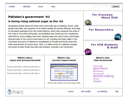
Xlab, UC Berkeley
I created a redesign for UC Berkeley's Xlab. They are still filling in their content, but here is a screenshot of the front page:
2010
RESIN Team, UC Berkeley
http://ccrm.berkeley.edu/resin/
I had a wonderful time creating a site with the research team RESIN, which stands for Resilient and Susainable Infrastructure Networks. RESIN, headed by Professor Bob Bea, studies the infrastructure systems of Sherman Island, a major choke point for power to the San Francisco Bay Area in the case of an earthquake or other disaster. RESIN is part of a larger Catastrophic Risk Management research team, and they are comprised of civil engineers, organizational management experts, and others. I found that I work very well--joyfully even--with engineering teams. Their systematic thought lends itself well to my work style, and they have a strong appreciation for visual-spatial thinking so I had complete creative freedom, within the contstraints of their budget. As a nod to that budget, I used a UC Berkeley template as a starting point for structure, but I changed the visual design completely to suit my aesthetics and those of the team.
Office of Sustainability, TInkerbee Video
I produced this video for the Office of Sustainability using their guidelines for sustainable features that they wanted to highlight on campus. We had a budget of $30 for props and costuming, and a budget for 60 hours of my time. My concept was: Tinkerbell meets 1970's roller derby funk, and she acts as an avatar giving the viewer a tour of sustainable UC Berkeley. Kira Stoll, of the Office of Sustainability, came up with the avatar's name, Tinkerbee, and designated her as the UC Beeeeeeee. Undergraduates shot the still images to match my storyboard instructions.
2009
Understanding the Sudan, UC Berkeley Center for African Studies
http://understandingsudan.org/
I came to this project, funded by the US Department of Education, near the end. I needed to re-design the somewhat confusing navigation architecture and spruce up the visual design within given parameters. The Department of Education was so impressed with our efforts, calling it "the best site of it's kind" they had seen, that they gave us an additional grant to create a similar site for the Horn of Africa. (See 2011.)